1) EXT. ROAD - Early afternoon
There are different camera angles of her running away from the house. - Long shot of Amelia running past the camera
In the BG you can hear a piano instrumental
Dip to black:
2) EXT. AMELIA'S BEDROOM - Midday
Comes up with date: 25th November 1987
The style font should be typewriter (with the noise of typing when date is shown)
Amelia is in her room listening to records and she hears a strange noise
Extreme close up of Davids (her father) hand holding a knife covered in blood and in slow motion, the knife is shown being dropped on the floor
3) Low angle shot of Amelia slowly walking down the stairs.
Amelia walks into the living room to find her mother dead on the floor.
Amelia: Screams
4) An over the shoulder shot of Amelia's father.
As Amelia is looking at her mother, crying, you can see David behind her.
Camera is focused on Ameila screaming
Camera is later focused on David smiling with a sinister look within his eyes
5)As David is walking slowly behind Amelia
Two shot of them
Ameila looking around and breathing heavily
Thursday, 20 December 2012
Wednesday, 12 December 2012
Halloween essay
A lot of the opening scene is taken up by the opening credits, but during the credits, there is an image of a pumpkin with a candle inside and whilst the credits are going on, the camera slowly gets closer and closer to the pumpkin and the music in the background makes it tense, this will suggest what kind of film it is to the audience. At the beginning of the film, it is quite bright but when Michael (the killer) puts the mask on, the audiences vision is limited as they have made it look like the audience are looking through the mask and can only see from Michael’s point of view. Because the lighting is quite bright throughout the opening scene, unlike most horrors, this could suggest to the viewer that it may not be a typical killer, which is revealed 6 minutes in and you can clearly see that the killer is in fact a child. Even though it is quite bright in parts of the opening scene, it is also dark as it is filmed at night and before and after Michael has killed the girl, he is outside and it is dark which could show that he about to do something bad and afterwards, he has done something bad.
In the opening scene, you can see a blond (most likely popular) girl kissing her boyfriend and then going upstairs which suggests that they are going to have sex. Typically in horror films, the blond non virgin girls are usually the ones to die first so as soon as you see her go upstairs with her boyfriend, the audience can guess that she is going to die so we get an idea of what is about to happen. Children are represented in a negative way as a child is the killer; this could be because children are usually seen as sweet and innocent, but in fact they may not be quite so sweet and innocent. Teenagers are also represented in a negative way, because she is killed by a child, this could mean that teenagers are weak and can’t defend themselves.
The knife used is very iconic because as soon as the knife is picked up, the audience can tell exactly what is going to happen. In horror films, knives are mainly used for stabbing and knives are used in almost every slasher horror film so when someone picks one up, you already know that someone is about to be killed, or the person with the knife will at least try to kill someone. Also, the mask is iconic as it almost hides the killer from us, even though we can’t see the killer because the camera is from his point of view, it feels as though he is hidden and is also feels like the audience are hidden from the killer because of the mask and in a way it makes the audience feel safer. The type of music played hints what type of film it is and most people recognise the sound from similar horror films and they associate that type of music with horror films, also the music builds up the tension and can hint what is about to happen or it can trick the audience into thinking that something is about to happen when it’s not. Whilst Michael is going up the stairs, the lighting is quite bright which could possibly trick the audience into thinking that something bad may not happen even though they have already seen Michael pick up the knife.
There is a lot of non diegetic sound, such as the creepy music which builds up the tension and gives the audience an idea of what is about to happen. There also a fair bit of diegetic sound, such as the ticking clock, the ticking clock suggests that it is someone’s time to die. Also, the killer going up the stairs, stairs are another horror convention which would suggest to the audience that something bad is about to happen.
Wednesday, 5 December 2012
Film scripting
EXT = Exteria
Fade in = Transition
BG = Background
FG = Foreground
ECU = Extreme Close up
CU = Close Up
What we need in our scripts:
Fade in = Transition
BG = Background
FG = Foreground
ECU = Extreme Close up
CU = Close Up
What we need in our scripts:
- Dialogue
- Background/foreground
- Time of day
- Fade in/out
- Information on key shots
Thursday, 29 November 2012
Wednesday, 28 November 2012
Thursday, 15 November 2012
Sunday, 16 September 2012
First pictures School and City Centre
We took this photo in black and white because it makes people focus on the person in the photo. We were aiming to make the subject (Matt) the focal point of the image. I think we have succeeded this because he is in the centre of the picture and the colours contrast with the background. Originally we intended for him to be posing off the ground but we found this difficult capture due to the camera limitations. To improve on this we could have used burst shots which means we could have gotten at least one image of him in the air. There is no special camera angle with this shot.
.JPG)
.JPG)
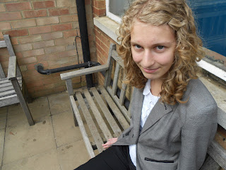
We took this photo in colour because we wanted to capture some distortion of the subject which can give an impression/mood from the person being focused on in the photo. We are still following the rules of thirds with the bench in the background and me being the subject foreground. To improve on this picture we could have taken it black and white to give the picture more effect of me looking evil.
We took this photo in Sepia because we wanted the focus to be on the subject (Ellie) as the tree is a deep green and would have been overpowering in the photo. Which would have meant the subject wouldn’t be the focal point of the photo. We have used the rule of thirds but the subject is still in the centre of the photo.
We took this photo in colour because there are lots of strong colours in the background. This is a long shot portraying me using the rules of thirds. Laura is in the foreground with the walk way leading out of the shot. By doing this we have achieved greater depth in the picture. An area to be improved is to look for distractions in the picture as one of the teachers is in the background.
We took this picture from City Hall. We decided to take this picture because of the interest in the foreground and background. The rule of thirds applies because there is something in the whole of the picture apart from the top horizontal three. The sun is shining behind the Church which emphasises the Church, showing that it is just as important as the Lion. We could improve this picture by avoiding any incoming traffic, which affected the picture as there was a van in this photo.
We decided to take this photo in colour because of the way the bright background colours stand out against the dark foreground. The picture was taken from a sitting position and the slightly heightened view suggests a ‘looking out into the world’ perspective. The rule of thirds applies because all of the action is happening in the top right of the photograph. When the rule of thirds overlay is present we can see the evidence of how the action is in the top left thirds. Even though there are bright colours in the right of the photograph our eyes are drawn to the left of the photo as this is where the ‘action’ is happening. I think that an improvement to this photo could have been taking it earlier so that the people were not in the photo. This would allow the viewer to focus on the bus and the background rather than the people. Although the people do give a better idea of life passing by.
We took this photo in a natural setting because we thought it would add effect because they don’t know we are taking the photo. By doing this it means. It adds how people would normally act instead faking it all. In the photo you can see Norwich market and the shops around it. The angle we took it from is high up and looking down onto the specific area. We did this because we wanted to capture the entire view of Norwich market, the people and the scenery around it. I don't think the rule of thirds applies as there’s no real focus upon the picture. My overall thought of the picture is that, it's good but we could have done better, by emphasising the rule of thirds.
Subscribe to:
Comments (Atom)


