We took this photo in black and white because it makes people focus on the person in the photo. We were aiming to make the subject (Matt) the focal point of the image. I think we have succeeded this because he is in the centre of the picture and the colours contrast with the background. Originally we intended for him to be posing off the ground but we found this difficult capture due to the camera limitations. To improve on this we could have used burst shots which means we could have gotten at least one image of him in the air. There is no special camera angle with this shot.
.JPG)
.JPG)
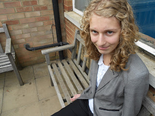
We took this photo in colour because we wanted to capture some distortion of the subject which can give an impression/mood from the person being focused on in the photo. We are still following the rules of thirds with the bench in the background and me being the subject foreground. To improve on this picture we could have taken it black and white to give the picture more effect of me looking evil.
We took this photo in Sepia because we wanted the focus to be on the subject (Ellie) as the tree is a deep green and would have been overpowering in the photo. Which would have meant the subject wouldn’t be the focal point of the photo. We have used the rule of thirds but the subject is still in the centre of the photo.
We took this photo in colour because there are lots of strong colours in the background. This is a long shot portraying me using the rules of thirds. Laura is in the foreground with the walk way leading out of the shot. By doing this we have achieved greater depth in the picture. An area to be improved is to look for distractions in the picture as one of the teachers is in the background.
We took this picture from City Hall. We decided to take this picture because of the interest in the foreground and background. The rule of thirds applies because there is something in the whole of the picture apart from the top horizontal three. The sun is shining behind the Church which emphasises the Church, showing that it is just as important as the Lion. We could improve this picture by avoiding any incoming traffic, which affected the picture as there was a van in this photo.
We decided to take this photo in colour because of the way the bright background colours stand out against the dark foreground. The picture was taken from a sitting position and the slightly heightened view suggests a ‘looking out into the world’ perspective. The rule of thirds applies because all of the action is happening in the top right of the photograph. When the rule of thirds overlay is present we can see the evidence of how the action is in the top left thirds. Even though there are bright colours in the right of the photograph our eyes are drawn to the left of the photo as this is where the ‘action’ is happening. I think that an improvement to this photo could have been taking it earlier so that the people were not in the photo. This would allow the viewer to focus on the bus and the background rather than the people. Although the people do give a better idea of life passing by.
We took this photo in a natural setting because we thought it would add effect because they don’t know we are taking the photo. By doing this it means. It adds how people would normally act instead faking it all. In the photo you can see Norwich market and the shops around it. The angle we took it from is high up and looking down onto the specific area. We did this because we wanted to capture the entire view of Norwich market, the people and the scenery around it. I don't think the rule of thirds applies as there’s no real focus upon the picture. My overall thought of the picture is that, it's good but we could have done better, by emphasising the rule of thirds.


No comments:
Post a Comment